Communitech Rebrand
Creative Director
The brief for our rebrand began with what leadership was calling the True North Strategy™: use data to identify the most promising, fastest-growing Canadian tech companies and put all of our resources behind them.
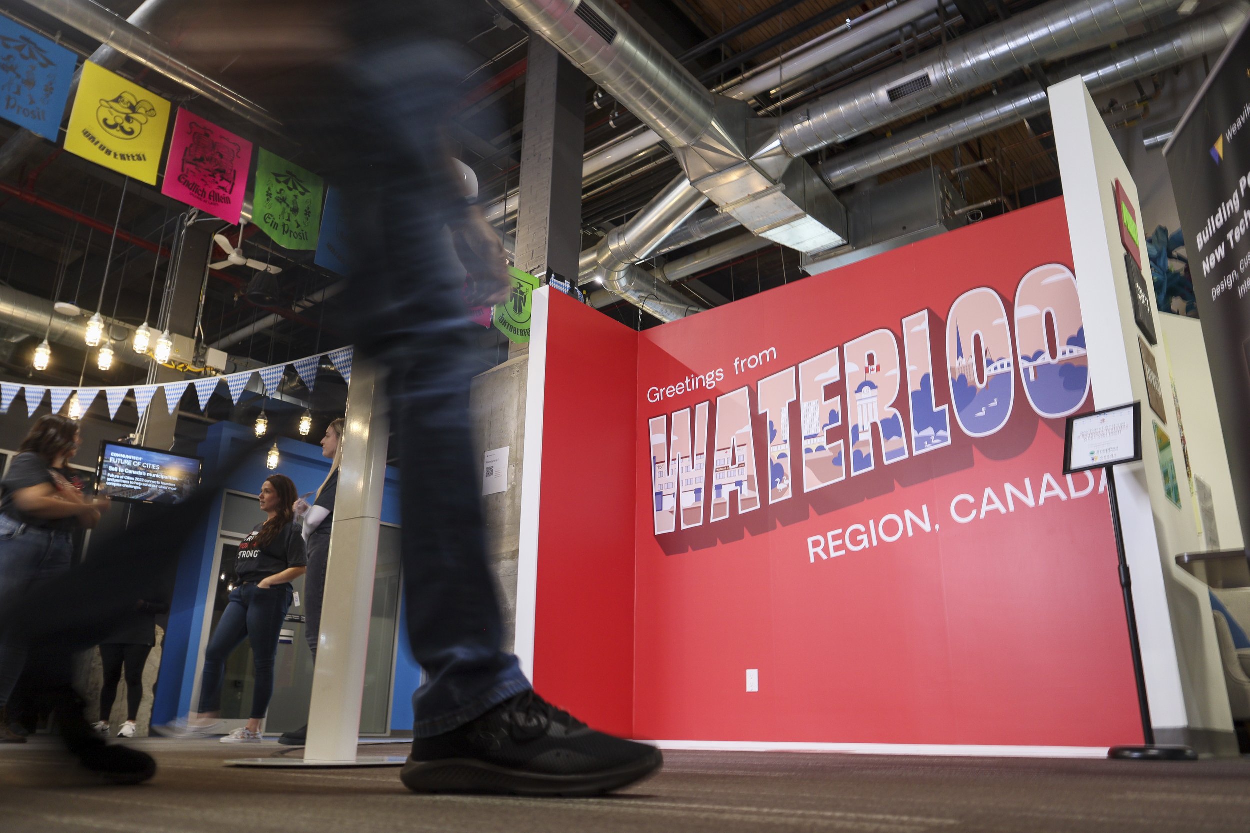
Communitech® would go from Waterloo Region’s tech hub to Canada’s tech supercharger™; the innovation engine that helps these founders with the talent, capital, sales and community to make it to a billion dollars in annual revenue.
After 25 years of the same logo, I was tasked to update it to reflect the massive growth in the Canadian tech scene. The new logomark should feel like a badge of honour, something that would be sewn onto a backpack, feel reminiscent of an Olympic team, and be unmistakably Canadian.
The logo conception and execution was all done in-house under my leadership.
The legacy logo included bold, sans serif and an inversed blue triangle, representing the tri-city area of Kitchener, Waterloo and Cambridge, Ontario.
I wanted to keep the bold all-caps typeface to have a common thread to the previous design and feel familiar, and refocus the symbolism to our new national reach.
Process sketches
New visual identity
In the fall of 2022, the new logo and visual identity were launched. Including a new colour palette, new typography, over 50+ new photography images shot in-house, a refined brand voice, a new suite of illustrations by Grace Stallard and an explainer video by Arc Media.

True North Red

Darkest Gray

Ice Gray

Burgundy

Midnight

Go For Gold


Video Projects
Bringing it all together