
Kitchener-Waterloo Skating Club
A fresh logo and full visual identity for Canada’s largest skating club, founded in 1938.

01
Project snapshot
Canada’s largest skating club needed a modern look to match its Skate Canada affiliation and show up better online.
- Client
- Kitchener-Waterloo Skating Club
- Year
- 2025 - 2026
- Services
- Brand identity, Photo art direction
- Industry
- Recreation
02
Brief
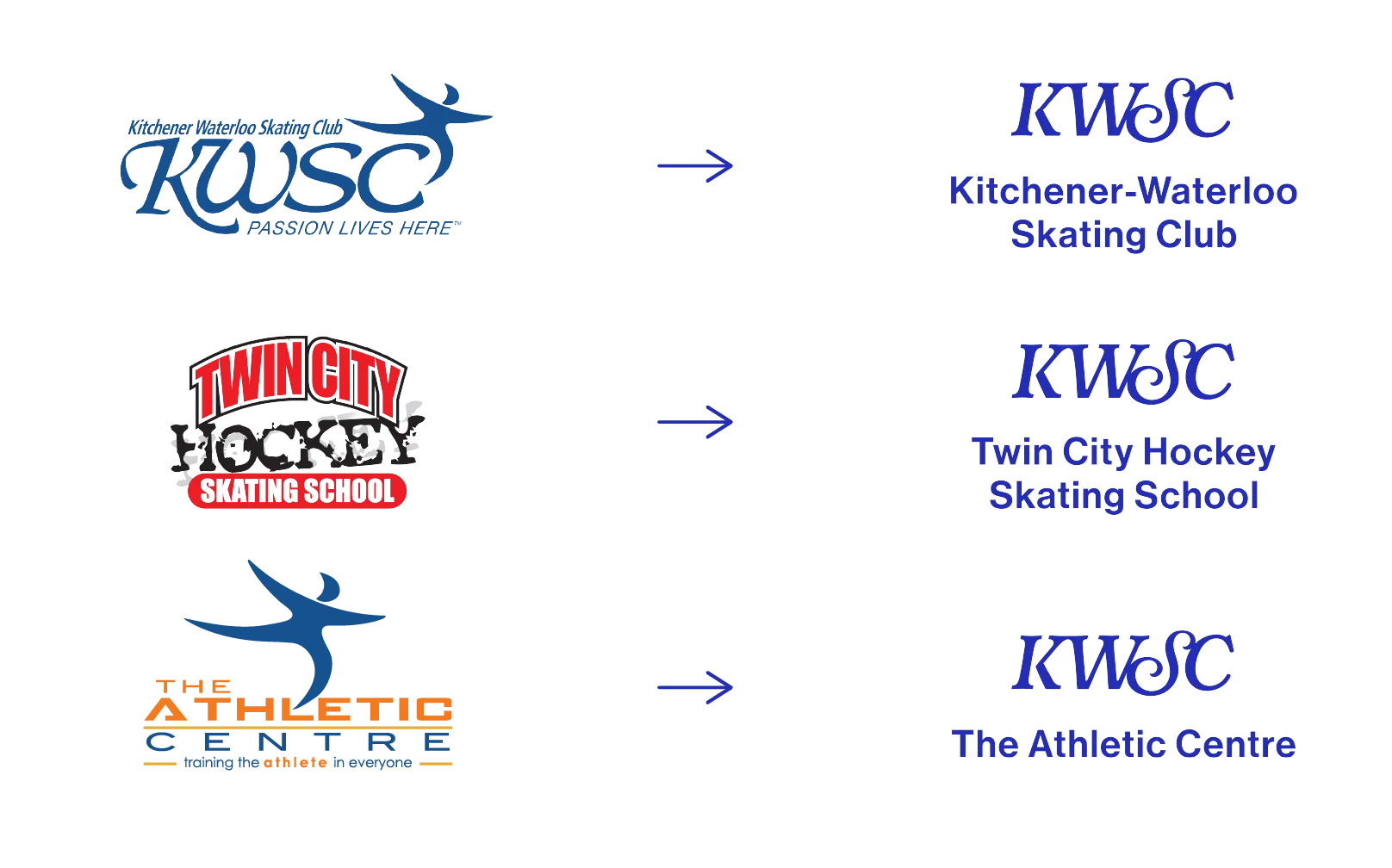
KWSC’s programs were split across three logos (one over 20 years old!), which confused members and didn’t hold up on screens. The club needed one modern identity that could cover everything from figure skating to hockey to dance, work on screen, embroider cleanly and be easy for everyone to read, including new Canadians.


03
Role
KWSC hired me directly, and I led the whole project: research, creative direction, identity design, project management and art direction of a custom photoshoot with photographer Alex Kinsella. The club’s five-year strategic plan guided the direction, and their team wrote the marketing copy.
My responsibilities
The team
04
Approach
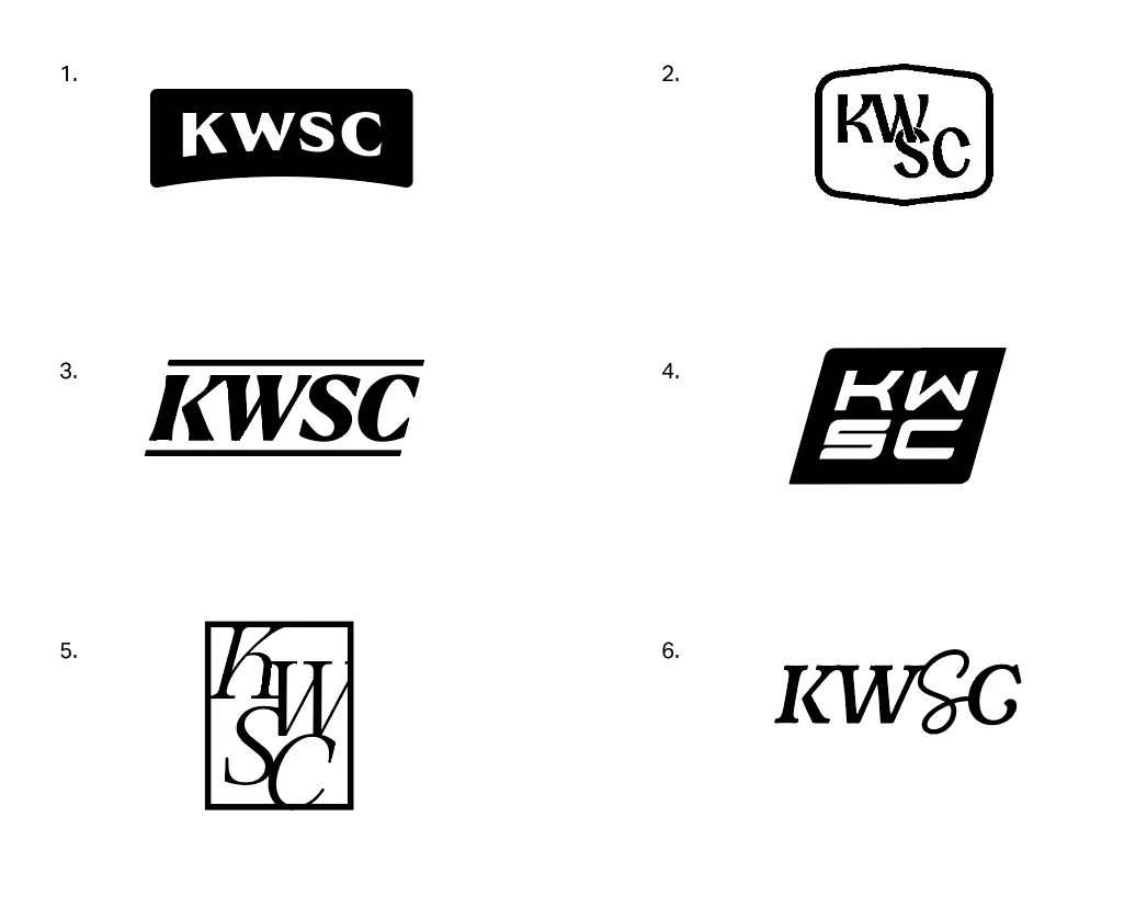
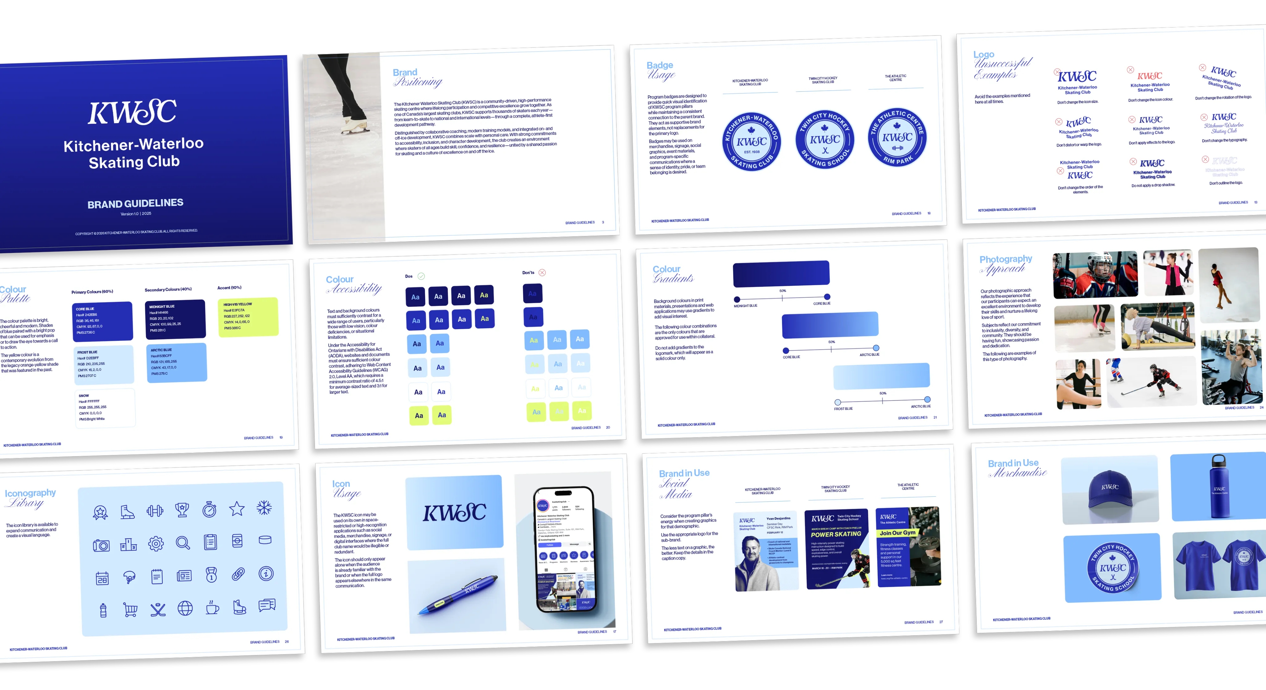
I suggested forming a committee of coaches, athletes, parents, staff and executives to join our workshops and design reviews. Design by committee can sound daunting, but in community organizations, people who feel heard become a brand’s biggest fans. Ten icon ideas became four full logo options, and the committee unanimously picked a monogram: a natural evolution of the old logo that brings every program under the KWSC banner. A refreshed palette and an easy-to-read sans serif round it out.
05
Result
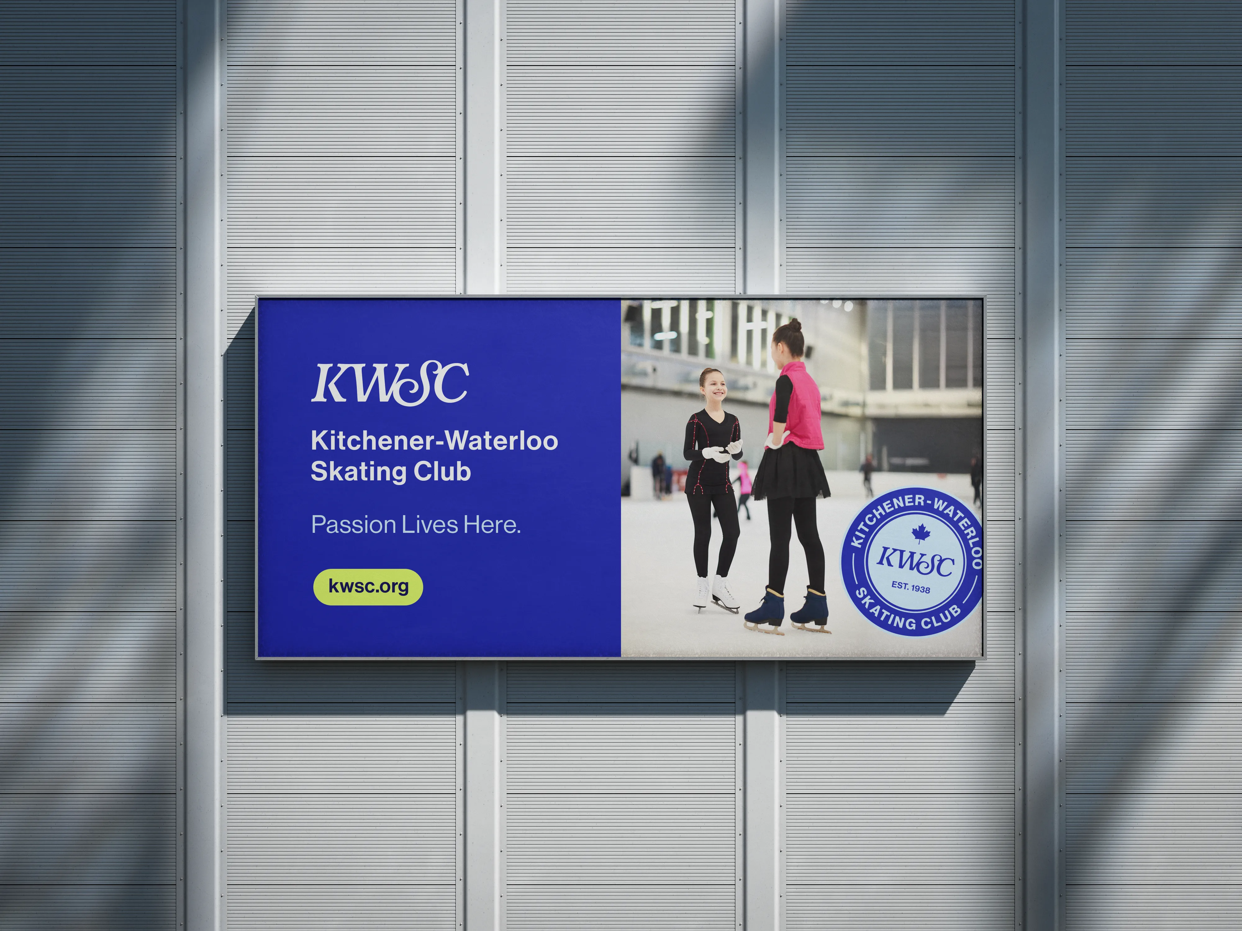
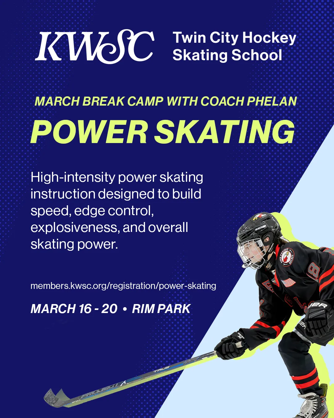
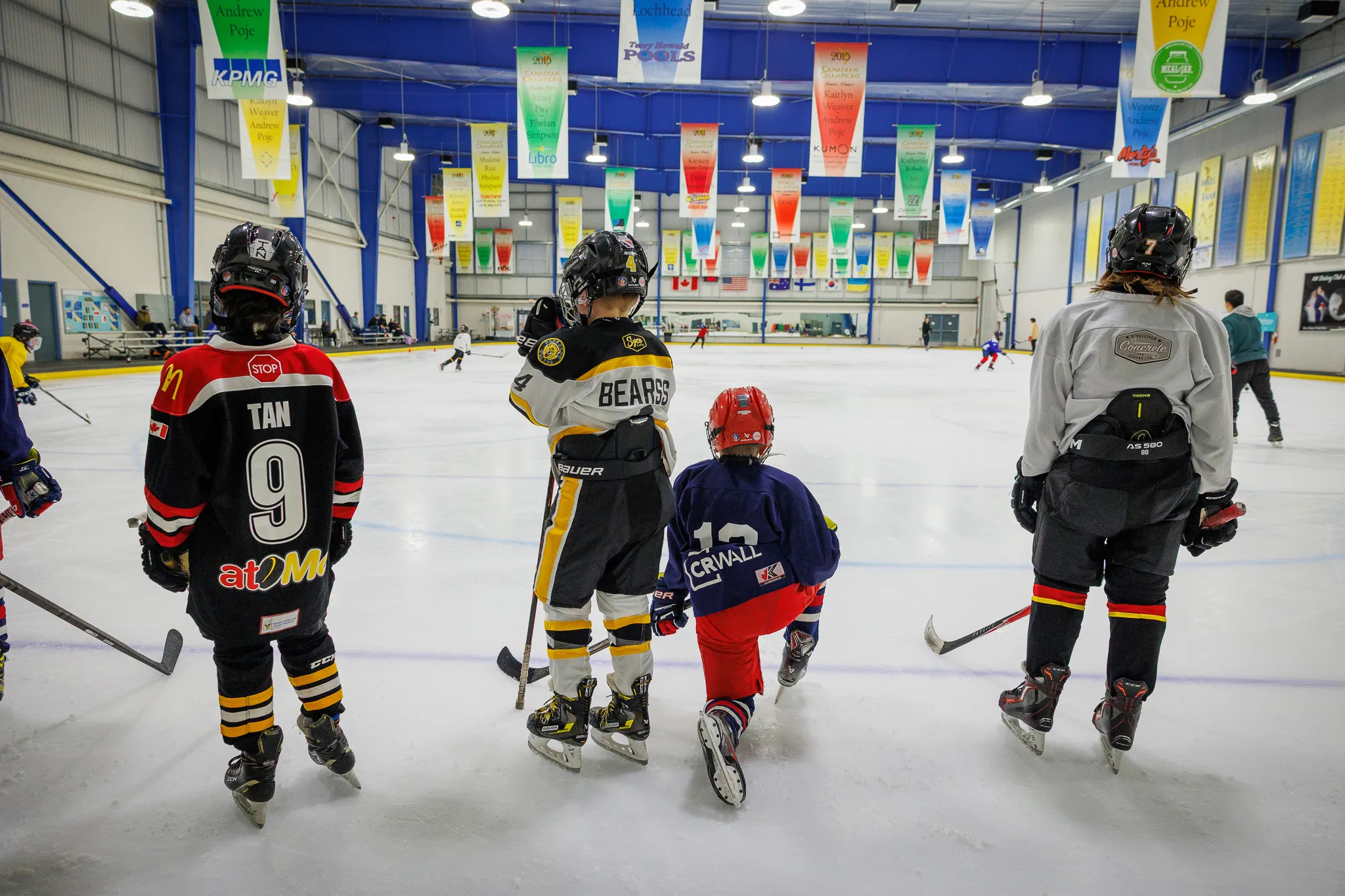
Three mismatched logos became one system that looks consistent everywhere, from social media and signage to athlete apparel. Once the logo was approved, a two-day photoshoot captured the club’s programs, sports and facilities. Image credit 02, 05 and 09: Alex Kinsella.







06
“Working with Sacha on our rebrand was a fantastic experience. She is a gifted designer who brought a modern, elevated vision to the Kitchener-Waterloo Skating Club while honouring the history and heart of our organization. Sacha confidently guided our committee with clarity through a truly collaborative and well-led process. The final result feels aligned with who we are and where we’re going, and her support throughout the rollout made the entire transition seamless.”
– Rachel Kerswill, Communications and Events Manager, Kitchener-Waterloo Skating Club
