Brand Identity: Kitchener-Waterloo Skating Club
Creative Director, Designer, Brand Strategy & Project Management
Brief
Established in 1938, KWSC is the largest skating club in Canada. The executive team asked for a modern visual identity that would function effectively in a digital landscape. The solution needed to unify multiple sub-brands and include a full suite of colours, illustrations, textures, photography and logo assets.
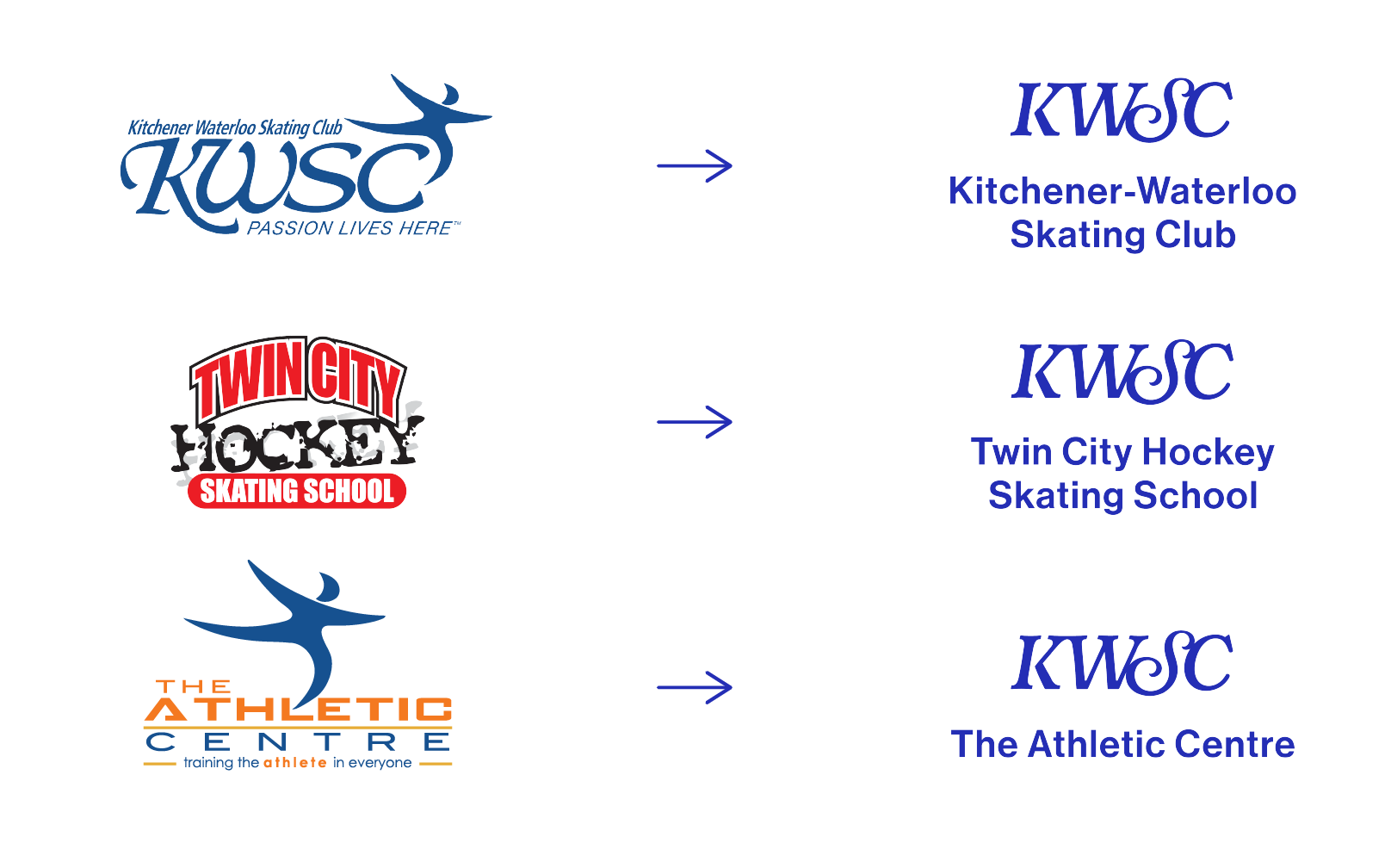
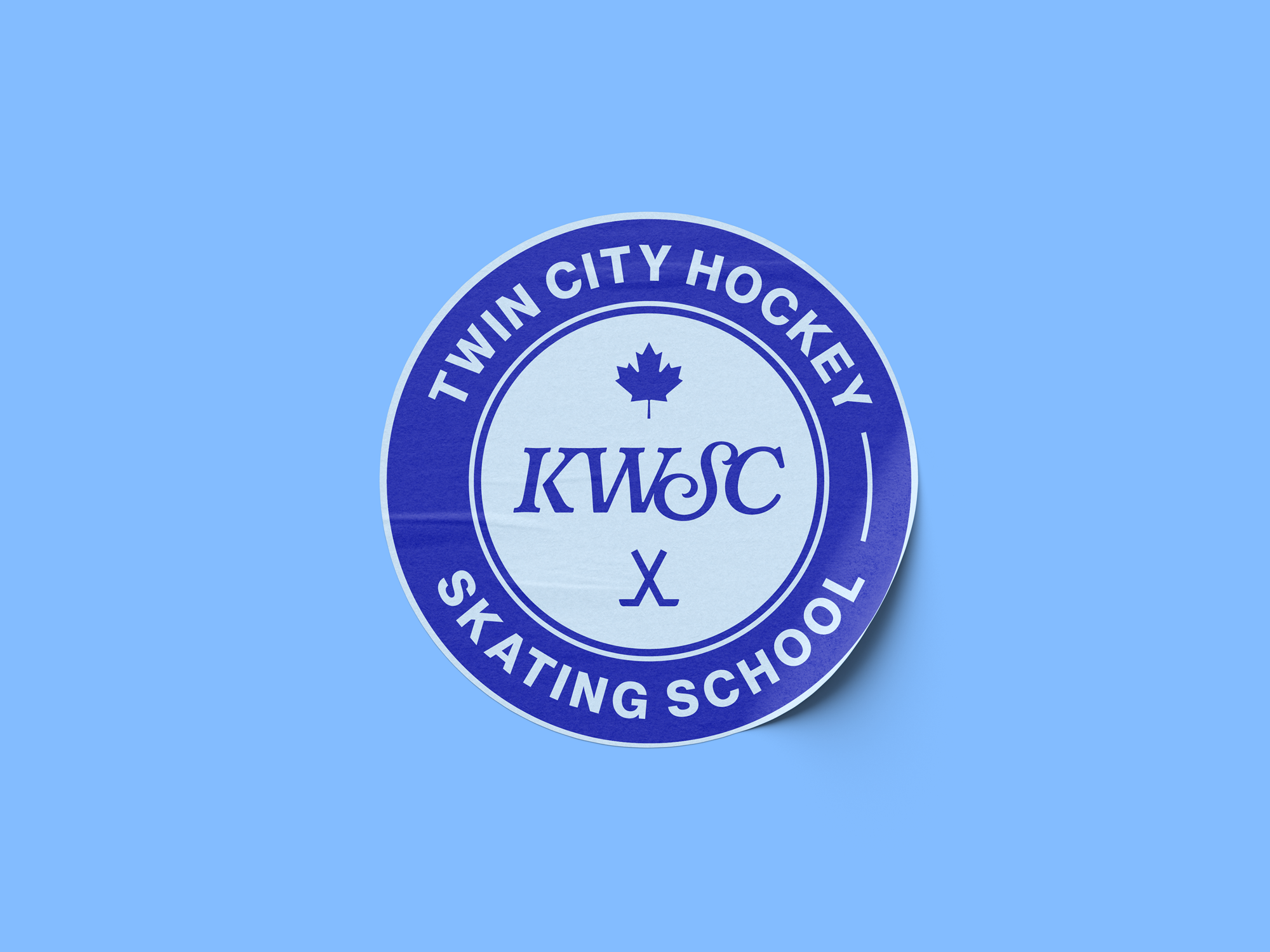
KWSC is a large and diverse skating community with multiple athletic programs operating under one umbrella: a beginner skating school operating under Skate Canada, a well-respected figure skating academy, a sought-after hockey training school and a robust off-ice training centre. The brand challenge was to visually unify these experiences under one parent brand.
Responsibilities
This was a one-woman design roadshow. I’ve learned from experience that when rebranding a community organization, the best designs come from the people who actually live and breathe the brand. With the support of the executive team, we brought in members of KWSC — coaches, program administrators, athletes and parents — to participate in design reviews throughout the process.
The final design was unanimously agreed upon. And while my fellow designers may have raised an eyebrow at the idea of adding so many cooks to the kitchen, I stand by the process: bringing in multiple perspectives resulted in a stronger, more thoughtful design solution that could support the many needs of this massive and diverse community.
Solution
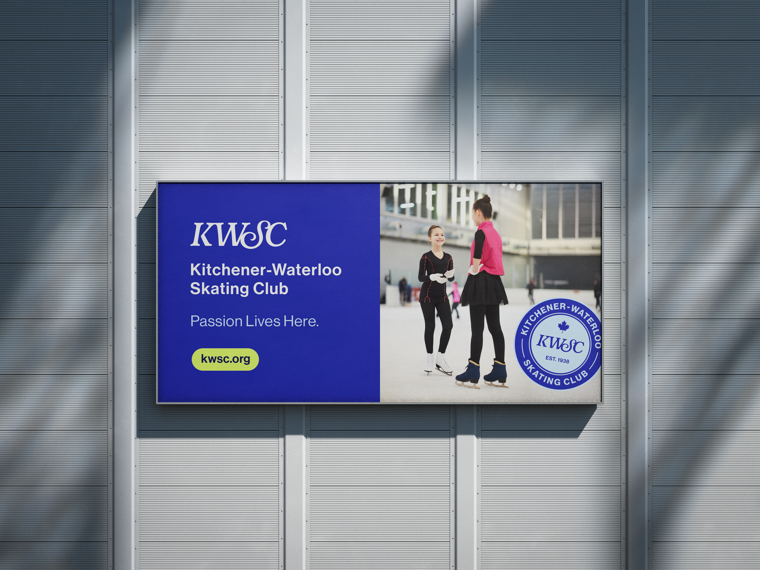
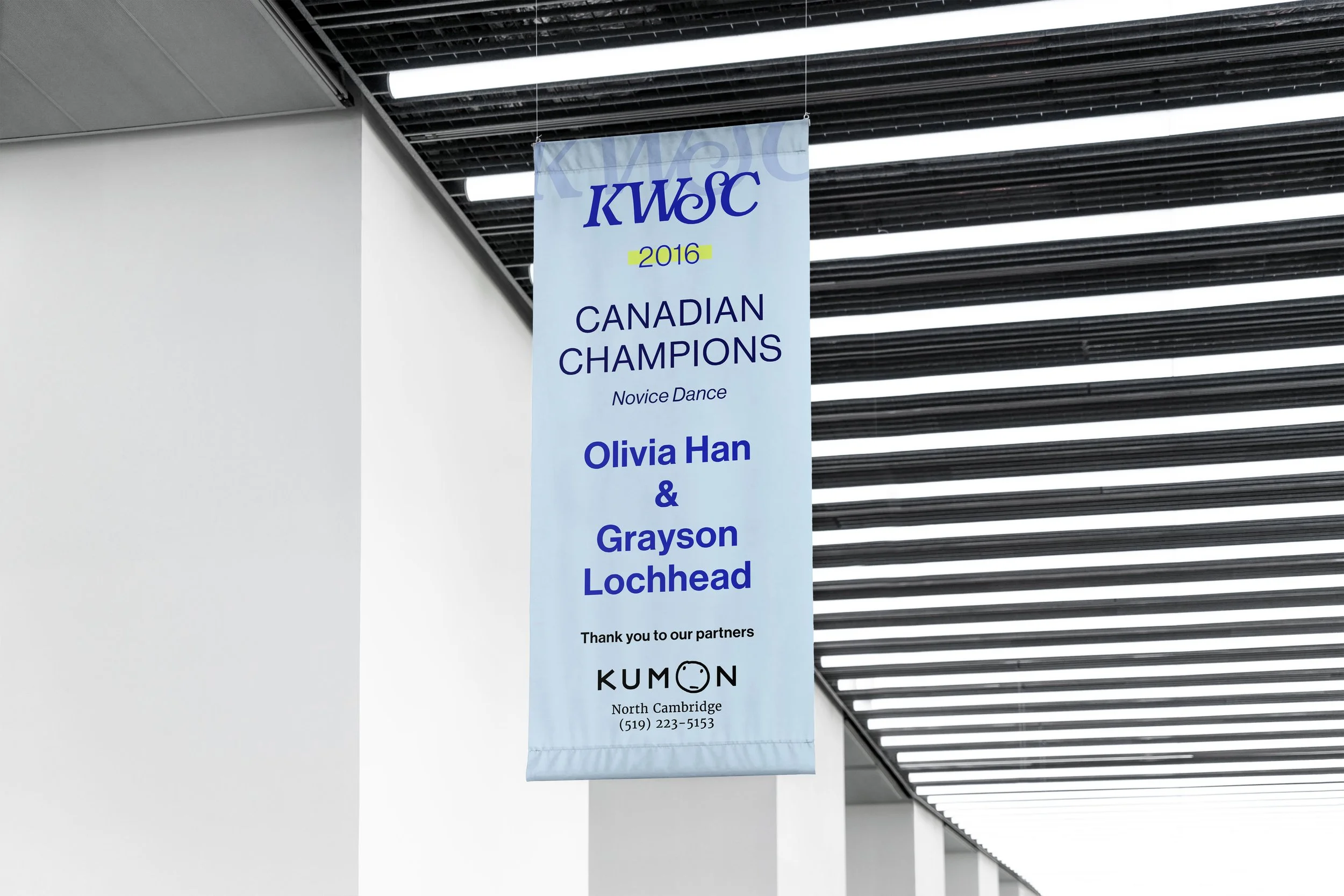
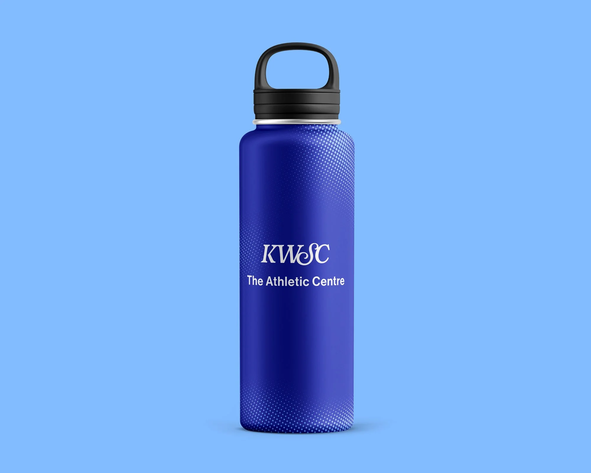
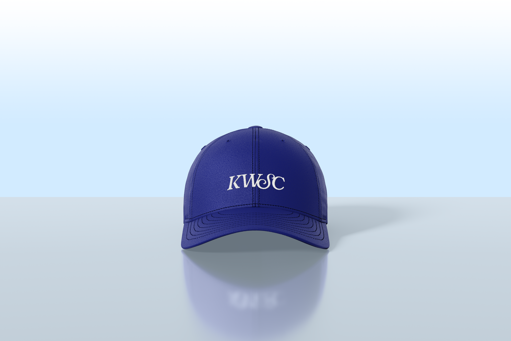
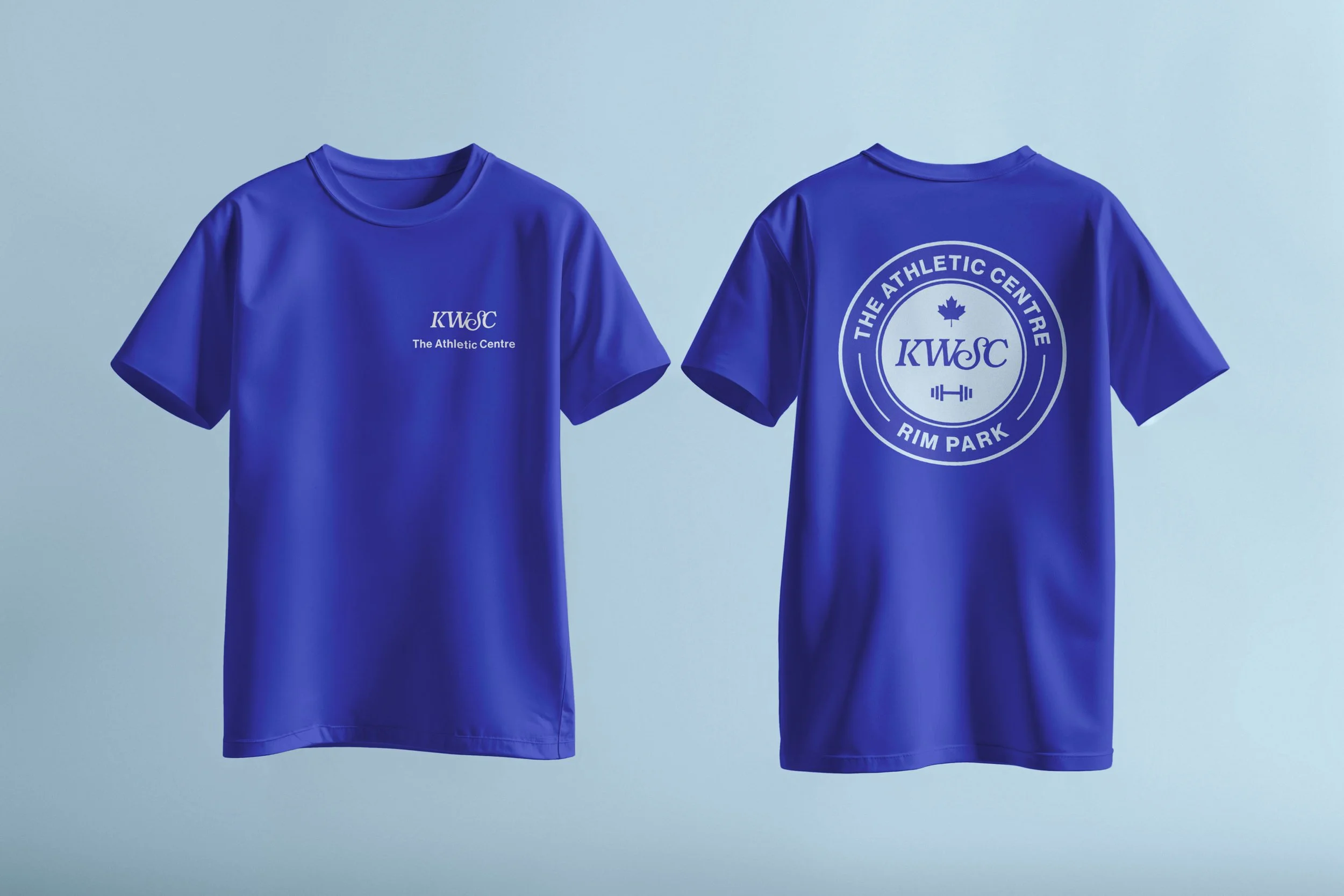
The previous brand package had three separate visual treatments with little cohesion. We unified these programs under one monogram logomark: a stylized KWSC that can be used independently or paired with a program-specific wordmark.
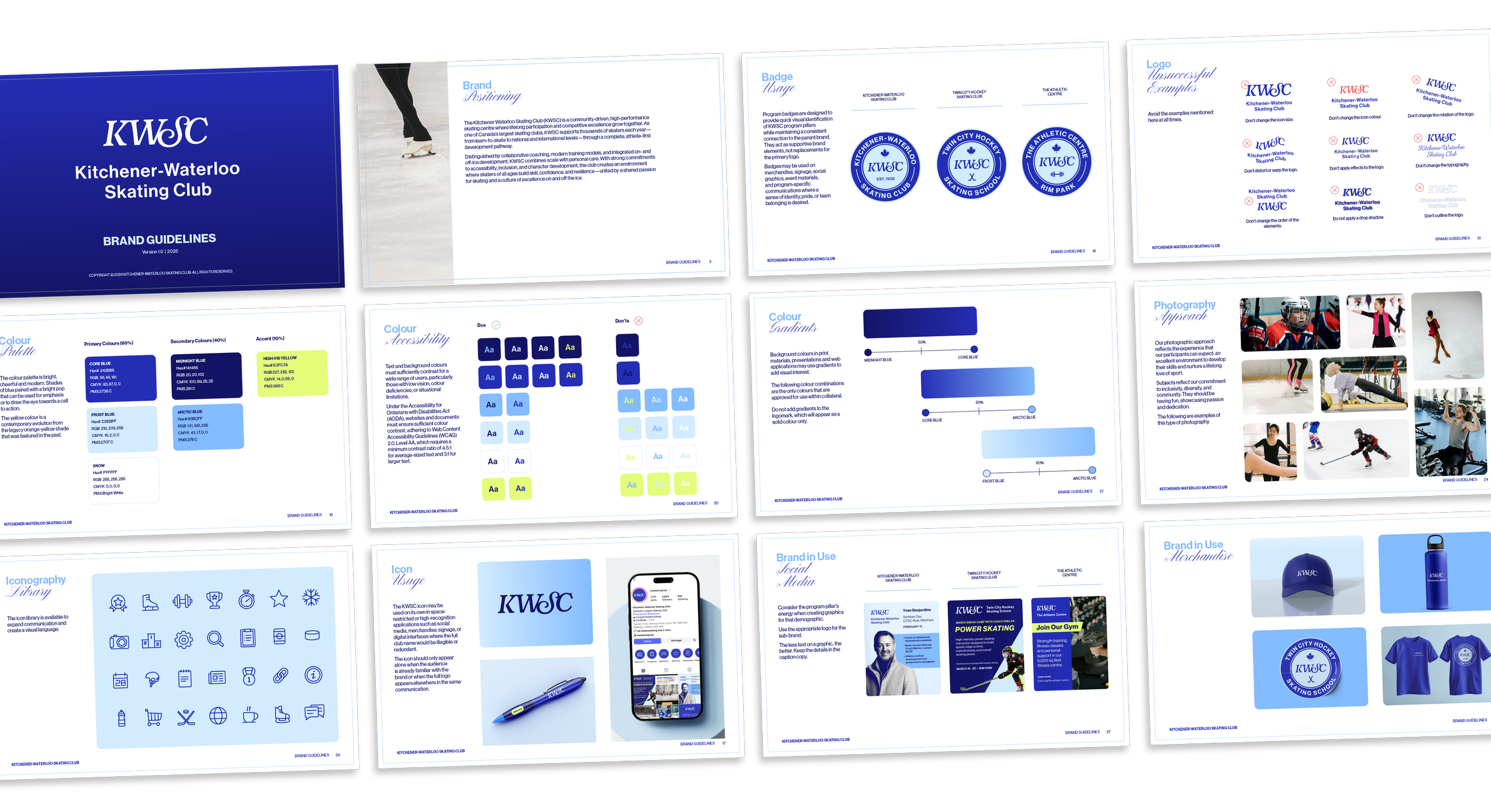
Brand Guidelines
Brand in Use


Photography
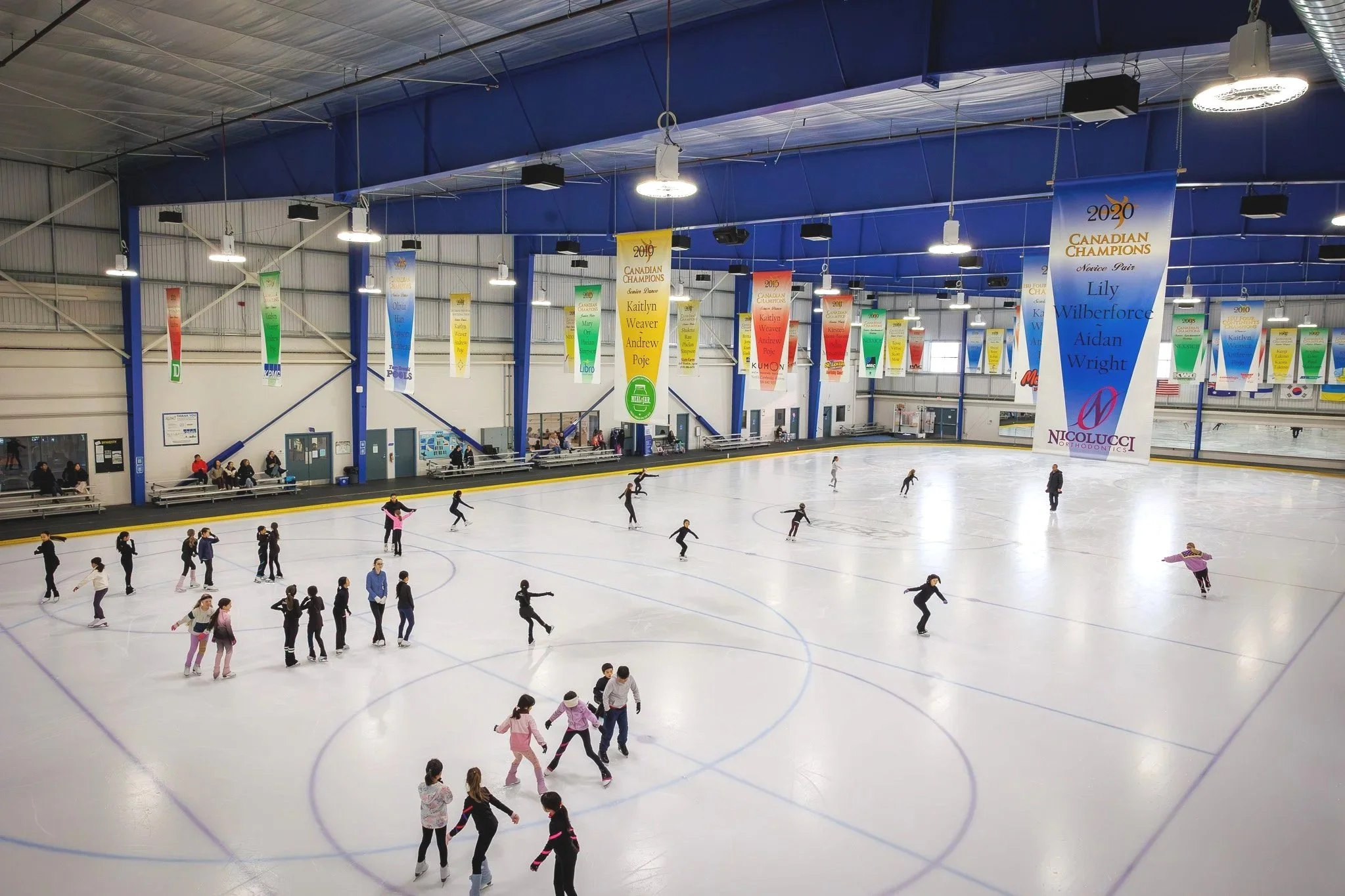
Bespoke photography covering (almost) all KWSC programming.
Art direction by moi, photography by Alex Kinsella.